

Tokyo Smoke
Creating a guided shopping experience for new Cannabis users
ROLE
UX designer
LENGTH
3 months
DATE
2018
During the summer of 2018, I had the opportunity to lead the UX research and design for Tokyo Smoke’s eCommerce experience — a cannabis retailer for the sophisticated smoker.
Tokyo Smoke was one of a handful of companies to gain an official license to sell cannabis in Manitoba come national legalization on Oct 17, 2018.
My team and I had just 3 months to research, design and build phase 1 of Tokyo Smoke’s Shopify online store in time for nationwide Cannabis legalization.
THE CHALLENGE
Transactional and legal: Tokyo Smoke’s online store needs to be fully transactional and comply with the legal guidelines set by Manitoba.
Omnichannel experience: The online store needed to reflect the in-store experience and integrate with it seamlessly.
Educate & guide: Most importantly, the site needs to educate and guide users throughout their cannabis journey.
THE GOALS

I was responsible for this project’s UX research and experience design. I was paired with a visual designer, Julio Wong. He and I were glued at the hip throughout this project.
MY ROLE & TEAM
Together we designed phase 1 of Tokyo Smoke’s online store. I was responsible for designing the site’s information architecture and wireframes while Julio created the final, high-fidelity mockups. Additionally, I stayed close to the engineering team as they built the site. I assisted with any on-the-spot UX calls and ensured the designs were built to spec.
Throughout this project, I also collaborated with team members from my agency, Demac Media, and our client, Tokyo Smoke, to define key aspects of the site’s experience and project requirements.

My contributions —
UX research
UX writing
Information architecture
Wireframes
Workshop facilitation

Competitive analysis
Since legalized cannabis was brand new to Canadians, it meant there weren’t a lot of precedents set, regarding UI/UX work. I broadened my analysis to include non-cannabis examples that shared aspects of Tokyo Smoke’s mission, too. This helped my team and I uncover examples we could leverage during the design phase.
Competitors —
Brands with a seamless, omnichannel experience, like Warby Parker
Brands that have built a strong community, like Glossier
Brands that marry education and commerce, like Lonely Planet
Research
While Tokyo Smoke provided robust foundational research, their research didn’t capture the needs of online shoppers and Cannabis eCommerce patterns. I conducted secondary research and a competitive analysis to fill in this gap.
Personas & journeys
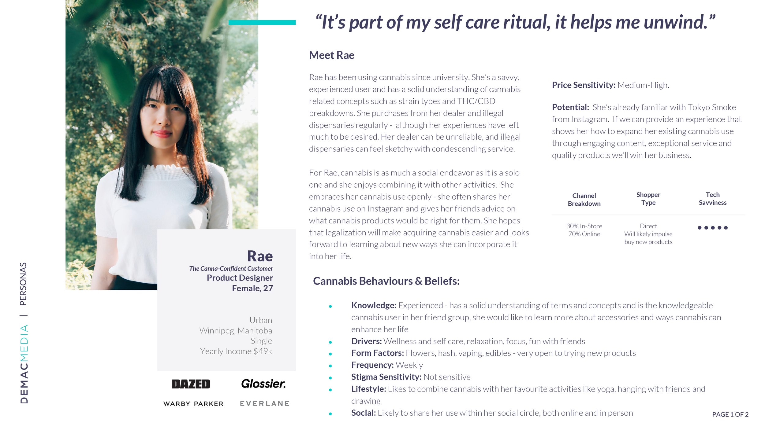
I synthesized my research findings into personas and their related user journeys: 2 primary personas emerged from our combined research.
The Canna-Curious User
Someone who is brand new to cannabis
Understanding their needs was critical, as the UX had to feel intuitive and welcoming for newcomers


The Canna-Confident User
Someone who is an experienced cannabis user
Designing with the Canna-Confident in mind ensured that the site would continue to speak to Canna-Curious users as they become more confident


How might we create an experience that empowers people to bring Cannabis into their lives confidently?
UX design
Main navigation
The UX design phase kicked off with the site’s navigation and product filters. I started with their information architecture. I then translated the IA work into wireframes for my client and team to review.
As I was designing the nav, I made sure users could accomplish 3 key jobs-to-be-done:
Discover products
Access community events and help
Get educated about cannabis
Product filters
To ensure people could find products easily, I designed the filters with a blend of eCommerce and cannabis options. I also added popovers to make the experience feel guided. When clicked, they’d provide useful information like definitions of cannabis terms.
Connecting online & offline touchpoints
An important part of this project was connecting the online and offline shopping experiences. A key way we accomplished this was through the ROPO flow (Research online, purchase offline). I designed the user flows and wires for this functionality. The flow allows customers to start their journey online and end it in-store — in pre-COVID times, this was still a novel concept.
Wireframe whiteboard session
To define the layout of the site, I led a collaborative whiteboard session with the Tokyo Smoke and Demac teams. By the end of the session, we designed the wires for the site’s key pages. Following the session, I refined these wires and created the related mobile wireframes. Then I handed them off to the visual designer, so he could translate them into high-fidelity mockups.

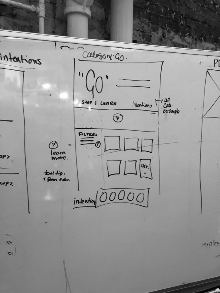


Ambiguity = modularity
At the time of this session, we were still waiting on the content guidelines from Manitoba. To deal with this ambiguity, we designed the pages with modular sections. So, if need be, content blocks could be removed without affecting the overall layout.
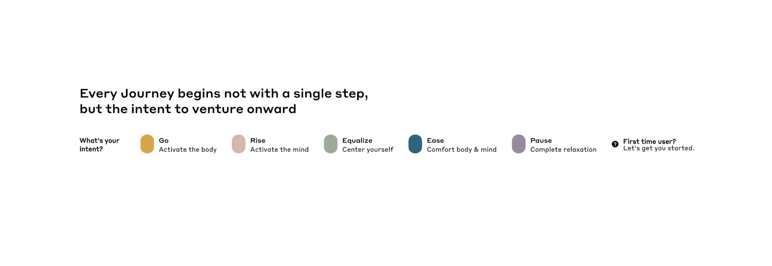
Setting intentions
During the whiteboard session, it became clear that a key flow for the site was introducing customers to Tokyo Smoke’s Intents. These 5 Intents represent the spectrum of cannabis experiences available to customers.
The visual designer and I teamed up to design this feature. We started by referencing the in-store experience. One aspect of the experience that stood out to us was the Intent Wall. As users shop the wall, they learn about each Intent.

We translated the Intent Wall into an online context, which we called the Intent Bar. Like the Intent Wall, it marries education with shopping. We also added a First Time User tab to provide additional guidance for Canna-Curious customers.
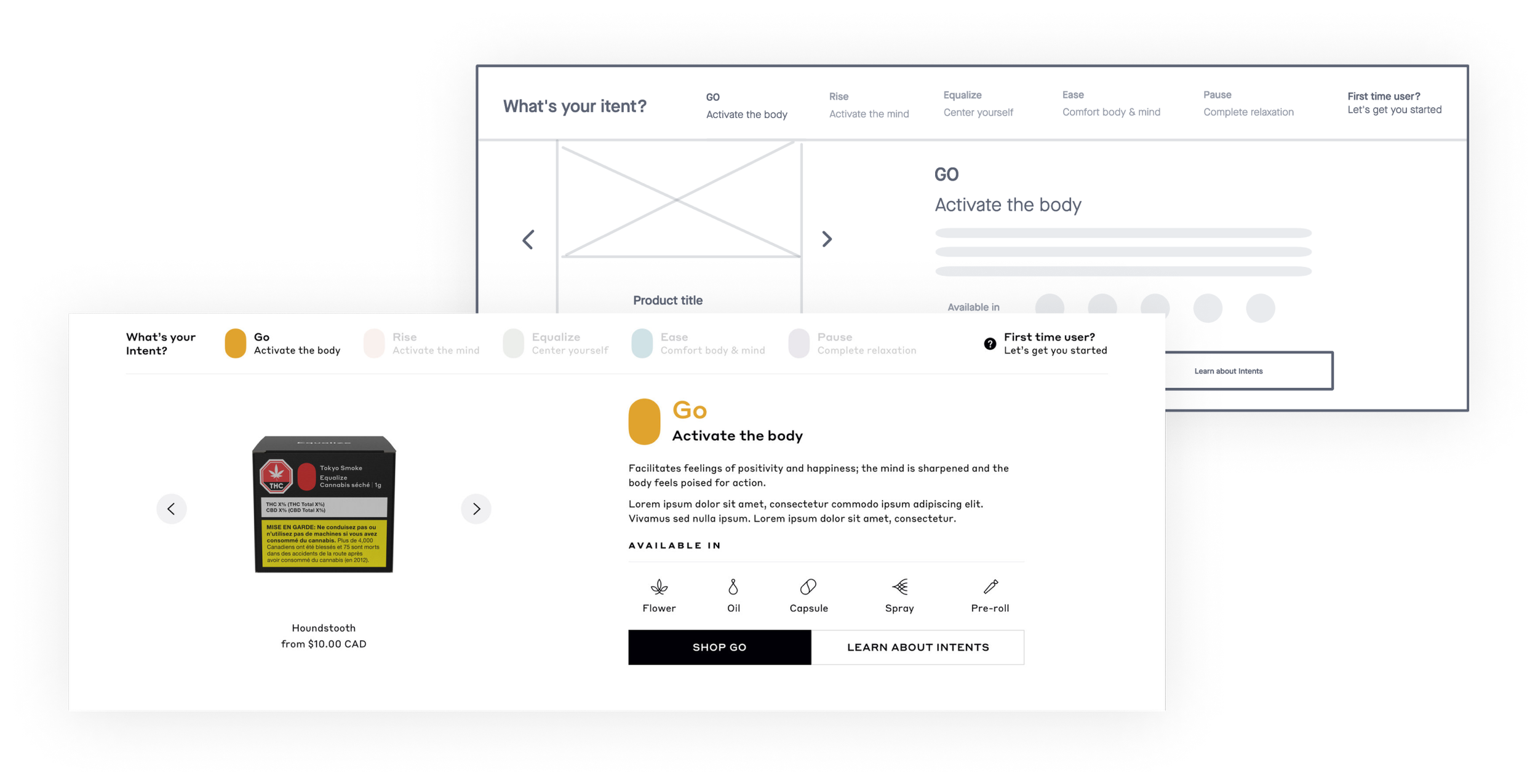
Image: Early design for the online Intent Bar experience, and it’s corresponding wireframe
User testing
After the visual designer completed the homepage designs, the Tokyo Smoke team had concerns about the Intent Bar. “Do users notice it?”, “is it helpful?” were some of the questions they asked us. To answer their questions, I proposed a usability test.
I designed and led the tests with 6 users, 3 from each of our persona groups.
“The site looks fancy, not like a typical weed shop. It’s not what I expected a weed site to be like.”
— User 1
“[On the Intent Bar] Is it some kind of wizard or walkthrough that explains how the site works?”
— User 2
“I like that there’s a help button in the menu. It’s really easy to find.”
— User 3
Key findings —
100% of users found the site trusty worthy and were “satisfied” to “highly satisfied” with the MVP experience
100% of users found the help resources easily
68% of users didn’t understand what the intent bar’s purpose was
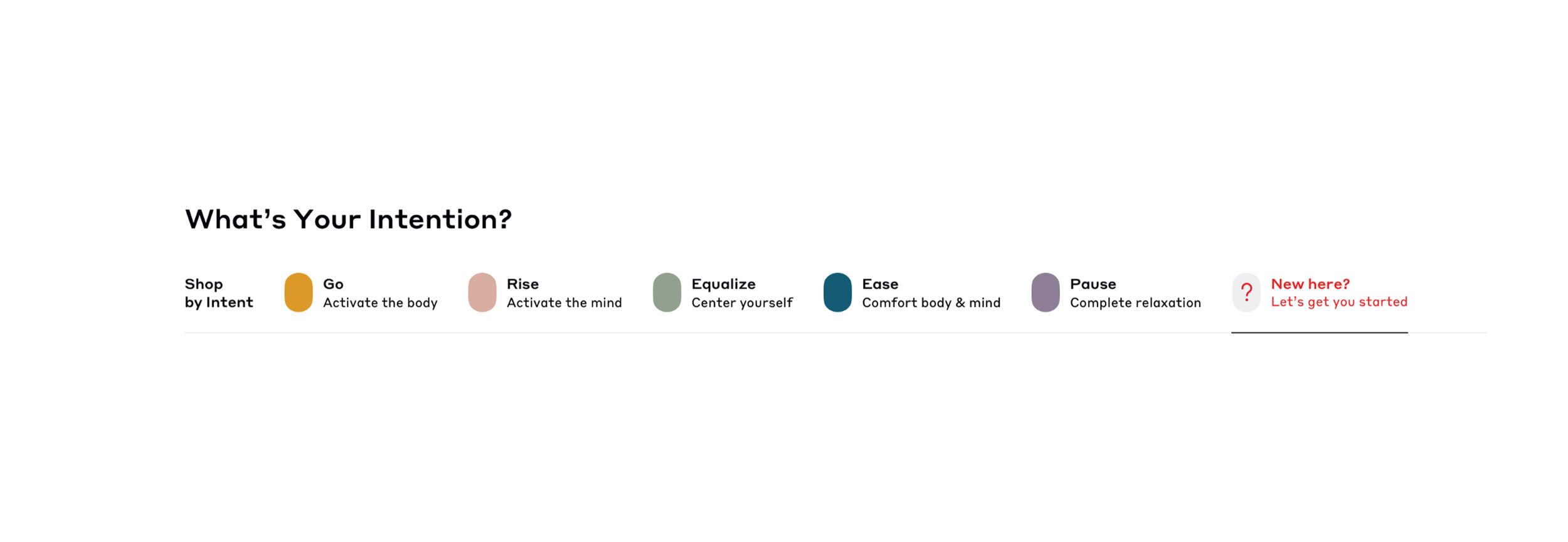
I synthesized the findings from the tests and together with the visual designer addressed the issues. This is how the designs evolved following the usability test…
Intent Bar updates —
Updated copy to make value and purpose clearer
Adjusted the layout to improve scannability
Updated the product card designs to improve clarity

Intent Bar - before
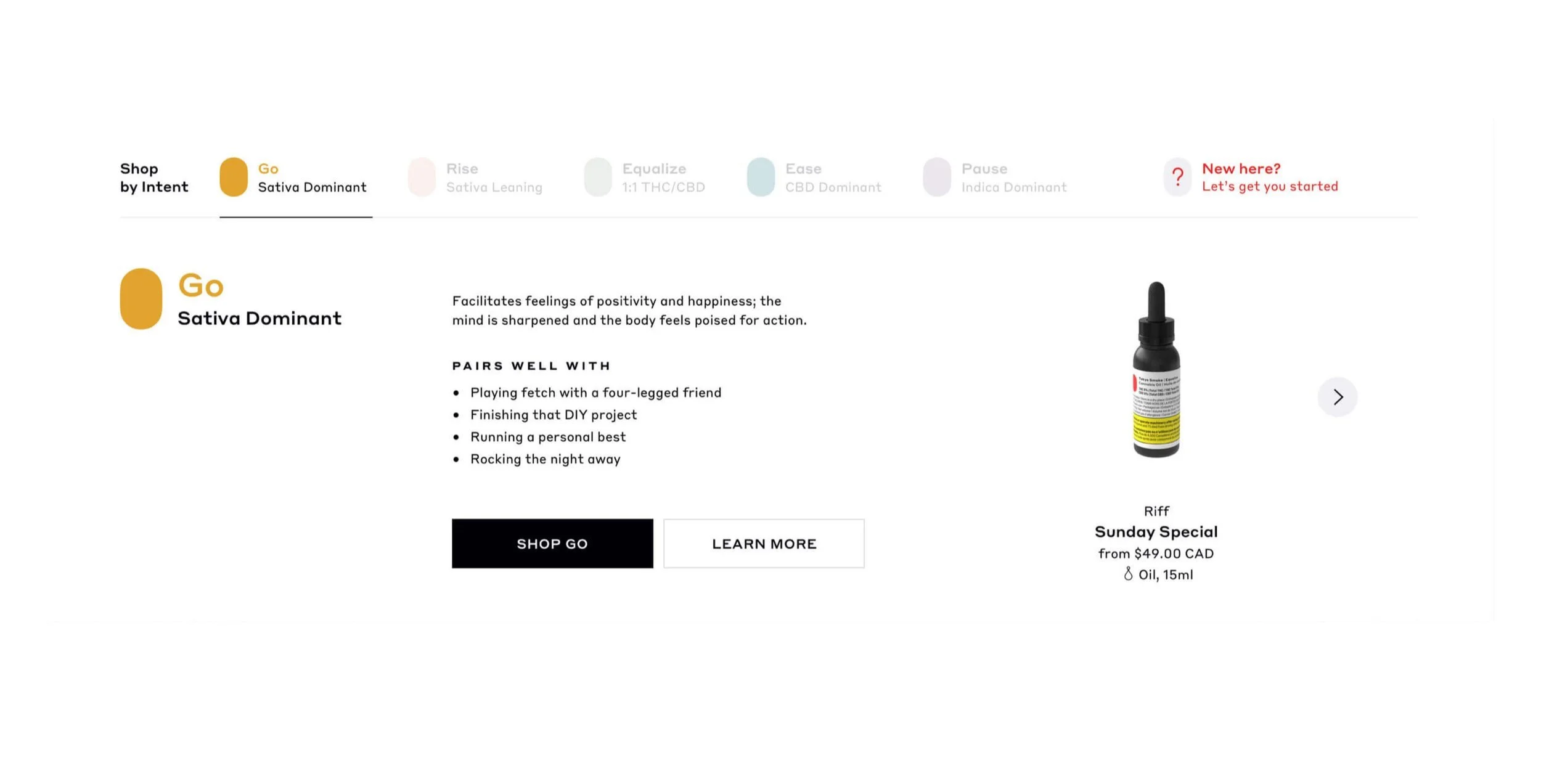
Intent Bar - after
First Time User Tab updates —
Enlarged the question icon to improve its prominence
Applied a gentle animation to catch users’ eyes
Updated the UX copy to improve its clarity
First Time User Tab - before
First Time User Tab - after
The usability test significantly improved our designs and addressed our client’s concerns. This helped both teams feel more confident about the site’s launch.
Final designs
The following final designs were created by Julio Wong. I think he absolutely nailed the designs and I had a blast collaborating with him.
Impact
A day after legalization, the site launched. In just 3 short months, my team and I successfully delivered a site that answered the brief and reflected the goals of our client. While the site was a massive undertaking that, at times, felt like the Manitoba government could cancel at any minute, it was an incredible experience that I’m so grateful I got to be part of.
Scalable site architecture to adapt to future needs
Fully compliant UX writing and site content based on legal guidelines
User-validated MVP experience with an 100% user satisfaction rating
Future enhancements
A few days before launch, the Manitoba government declared that all product claims had to be backed by science. Additionally, we couldn’t use any lifestyle imagery or pictures of cannabis. The site’s tone and voice were greatly impacted by these changes. This leaves some interesting design challenges to be improved on for phase 2 and beyond.